Currently working on this site, so if it's wonky, I'm tweaking it :)

UX/ UI Case Study:

a Dessert Ordering Website
My Role


UX Designer
Product Designer
Visual Designer
UX Researcher
Content Strategist
An Origin Story
"Madeline's Krispy Treats" started as a fall back plan that had materialized in my kitchen one day. My best friend and I said that if everything went south, we could always start a gourmet krispy treat business.
After creating the app, I decided to expand upon the idea with a matching website design.

Summary
I designed a website to match the app,
that helps customers create
a delicious treat to share with friends.
Project Goals
Solving Problems
This website is intended to solve the problem of choosing personalized selections while ordering gourmet, personalized snacks.
Build a helpful tool to assist a customer making a purchase.
Improve the experience of buying a rice krispy treat.
Explore the use of an illustrated middle justified menu for a more interactive experience
Approach
To build a brand new platform with the Madeline's Krispy Treat site, then gather insights on the experience from customers, with a focus on both long term and short term adjustments, expansions and community building.
Research Methods


Customer Interviews
Persona
Market Research Analysis


Customer Journey
Information Architecture
Prototype Testing
Customer Mindset
Wants to be able to
pick out a snack with
Katie for their playdate.
It's so Fun!
Fun Loving Parent
Lilly Ma
"I just want my kids to have fun"
The playdate loving parent who wants to make child happy with the cool "in" thing.
Will consult children for flavor profiles, seeking feedback from them to ensure their happiness.
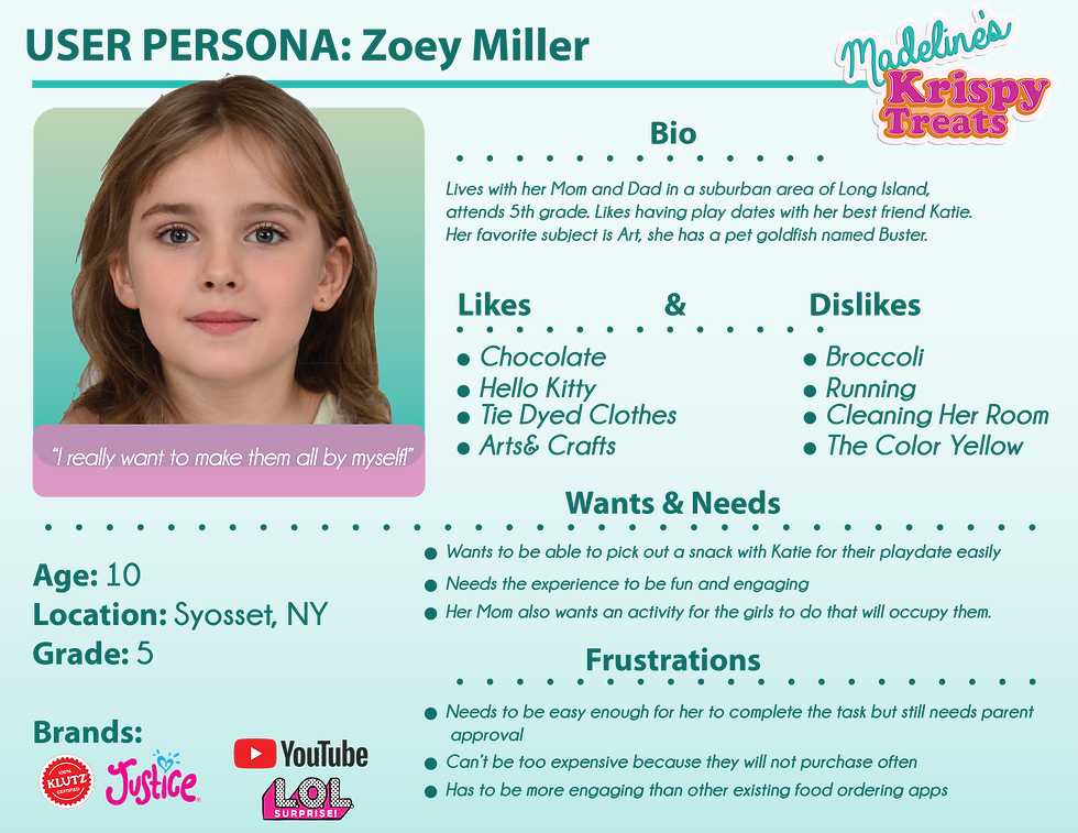
Child Who Loves the Product
Zoey Miller
"Dad, can we get that?!"
After having seen online advertising, she got permission from Dad to create her own. Went through every flavor combination before deciding her choice.
Child at Heart
Dan Smith
"What can I say? They taste really good."
One of Dan's customers brought him a plate of treats to the store, and since then it's been his guilty pleasure. Uses the app on the sly because it's easier than calling in his order.


Hope people don't shame me for using this.
Multiple User
Personas
helped see the product
and the customer's needs
through multiple points
of view

Getting Inspired


Some research based on wanting to see what specialized krispy treats were in the market, and what apps to order desserts were available.

Prototyping
Sketches/Low Fidelity Wire Frames
This is the design that was the inspiration for the final layout

High Fidelity Wire Frames


Style Guide
Text Choices
Champagne and Limousines Bold
Champagne and Limousines
Color Palate
#35BDB2
#DF7A1C
#CA3092


EXAMPLES OF TOPPING
Clean and Fun
The color scheme for the Madeline's Krispy Treat brand should evoke feelings of
Childlike Wonder.
Learnings
Clean & Bold
Following the style guide previously determined,
allowed for sleek but fun, bold ordering site.
I learned that its worth putting in all the little details.
